The Wilbur Mansion Editorial Shoot
Our top vendors collaborated with us on a brilliant photoshoot. With their efforts, our team produced two astounding designs to use as inspiration for your wedding. We wanted to demonstrate how our moodboards can come to life. When the details are thought through, a stunning and well designed event always follows.
With our first arrangement, we chose a whimsical garden theme that’s full of lively flowers. We played with different creams and colorful pastels. The banded fold napkins wrapped around in order to balance the ornately textured chargers and glassware. It’s like a breath of fresh air walking into the reception room and seeing this arrangement glow. The custom cocktails were served in iridescent coupe and lowball glasses for an extra pop of color. This magical garden bar moment brings a unique touch of brightness.
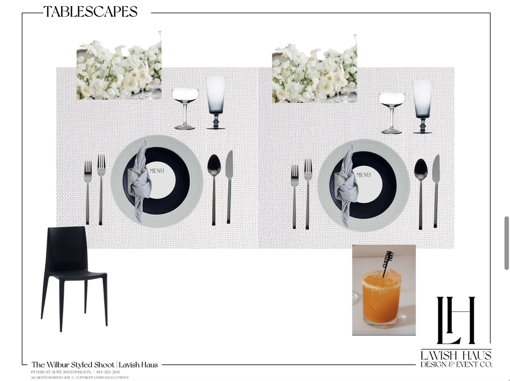
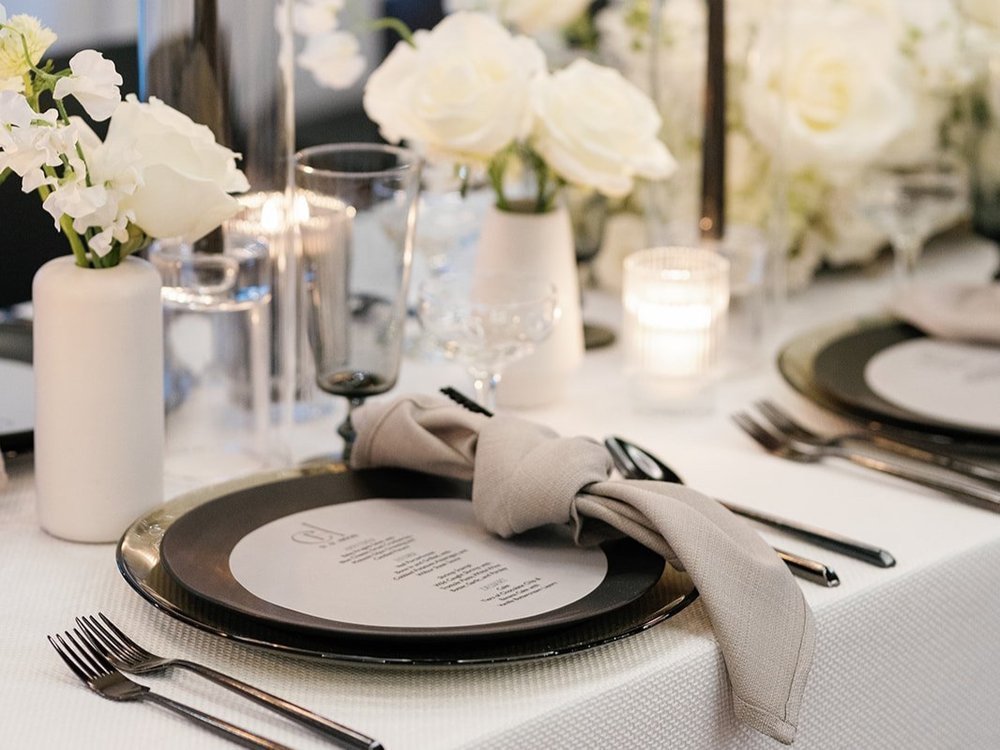
Our second presentation had a sleek modern vibe. Crisp, white flowers bordered the wedding arch outside. The black chairs lined the aisle and popped with the black architectural details of the venue. For the table setting, we chose smoked stemware and chargers. Custom circle vellum menus covered the opaque black plates to emphasize legibility. The textured linen elevated the entire tablescape. Linens are a great way to add color, pattern, or texture to the base of your table design. Our team set up a champagne tower as a dynamic moment for our two lovebirds. It’s the little things that make an impact in a big way. These modern and luxe details bring this black and white color palette to a whole new level.
Our team and our vendors worked so hard to produce these two aesthetics and we wanted to show it off to you. From the moodboard to real life, we love watching the design come to life. We consider color, texture, customization, florals, and guest experience while crafting your tablescape. This creates a cohesive, unique, and elevated design that encapsulates the vision of the day.
Vendors
Venue: The Wilbur
Planner/Designer: Lavish Haus
Florals: Kraft and Company
Photography: Bianca Tang Photography
Videography: Jennifer Sofia
Hair and Makeup: Alisha Nycole
Gown: Barbara Kavchock
Cake: Crumb Cake Studio
Tuxedo: Suit Shop
Rentals: Party Rental
Rings: Hitched


